Grouped Tooltips Visualization and Layout
Overview
This article describes how to alter the visual appearance of Grouped tooltips: change background, width, rows spacing, separator and so on.
Rows Separator
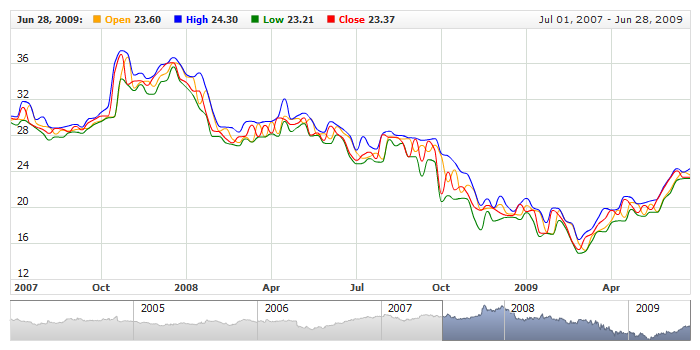
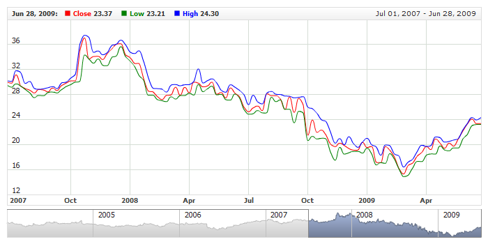
Grouped tooltip consists of several elements that come from different data series or indicators, by default they are separated by the line feed only,
but you can configure them to be separated by the visual separator.
Adding
Separator may consist of two lines: top and bottom, you can enable and disable each of them separately:
01 |
<?xml version="1.0" encoding="UTF-8"?> |
02 |
<stock xmlns="http://anychart.com/products/stock/schemas/1.9.0/schema.xsd"> |

Visual Settings
Each of the lines is configured as any other line, with opacity, color and thickness:
01 |
<?xml version="1.0" encoding="UTF-8"?> |
02 |
<stock xmlns="http://anychart.com/products/stock/schemas/1.9.0/schema.xsd"> |
Sample below shows the grouped tooltip with separators configured as shown above:
Live Sample: Grouped Tooltip - Using Items Separator

Putting elements in one Row
When there are a lot of series in the chart, or, for example, some subsequent series are bound logically, you may want to display them
in one row. To do so you need to set one element to be put in one line with previous - this can be done using put_in_line of
<grouped_tooltip> node.
XML sample below shows four series, which will be shown in two rows instead of four:
Live Sample with grouped tooltip where for elements are put in two rows:
Live Sample: Grouped Tooltips - Elements Rows

Rows Spacing
You can change the space between the rows in a grouped tooltip using items_spacing attribute of
<grouped_tooltip> node:
Live Sample of two similar chart and different spacing in their grouped tooltips:
Live Sample: Grouped Tooltip - Items Spacing

Positioning
By default tooltips is shown when you hover the chart and it follows the mouse as you move it over. You can change this behavior and set another positioning mode, if you'd like to.
Grouped tooltip positioning is set using anchor attribute of <grouped_tooltip> node. You can set one of the following value to it:
| anchor |
| Float |
| LeftTop |
| CenterTop |
| RightTop |
| LeftCenter |
| RightCenter |
| LeftBottom |
| CenterBottom |
| RightBottom |
All fixed anchors place tooltip in one position and tooltips always is shown there. Sample XML to set the anchor:
Live sample with two similar charts and tooltips placed to "RightTop" and "RightBottom" positions:
Live Sample: Grouped Tooltip - Position Anchor

Background
Grouped tooltip has a common background and title background. Title background configuration is described in Grouped Title description.
Border and Fill
Standard <fill> and <border> nodes are used to configure this background. Sample XML for configuration:
Live sample of the grouped tooltip with such settings:
Live Sample: Grouped Tooltip - Fill and Border Settings
To learn more about the possible settings see
Background Settings or XML Reference.

Corners
As any other background you have an ability to configure corners shape using <corners> node. Sample XML for changing the corners of tooltip:
Live sample of such settings:
Live Sample: Grouped Tooltip - Background Corners Settings
To learn more about the possible settings see Background Settings or XML Reference.

Shadow
You can also change and configure the shadow of tooltip. By default it is turned on, an you can either turn it off or reconfigure. Sample XML:
Live sample of grouped tooltip with red shadow:
Live Sample: Grouped Tooltip - Background Shadow Settings
To learn more about all possible settings see XML Reference.

Margins
You can configure inner margin between tooltip text and border. Simple XML Syntax:
Live Sample with configured margins:
Live Sample: Grouped Tooltip - Inside Margins Settings


